We recommend uploading images that are the size of the container they’re filling, this is why we want to help you upload them in a suitable size according to the design you have chosen.
For each product you can add as many images as necessary (with a maximum weight: 2 MB).
The format of the images should be JPG or PNG.
The sizes listed below are in pixels and they are expressed in Width x Height (example: 700 x 400 px).
For product images it is recommended to keep the product in the center of the image leaving some extra space for the adjustments that can make the system for viewing on different devices such as tablet or mobile phones.
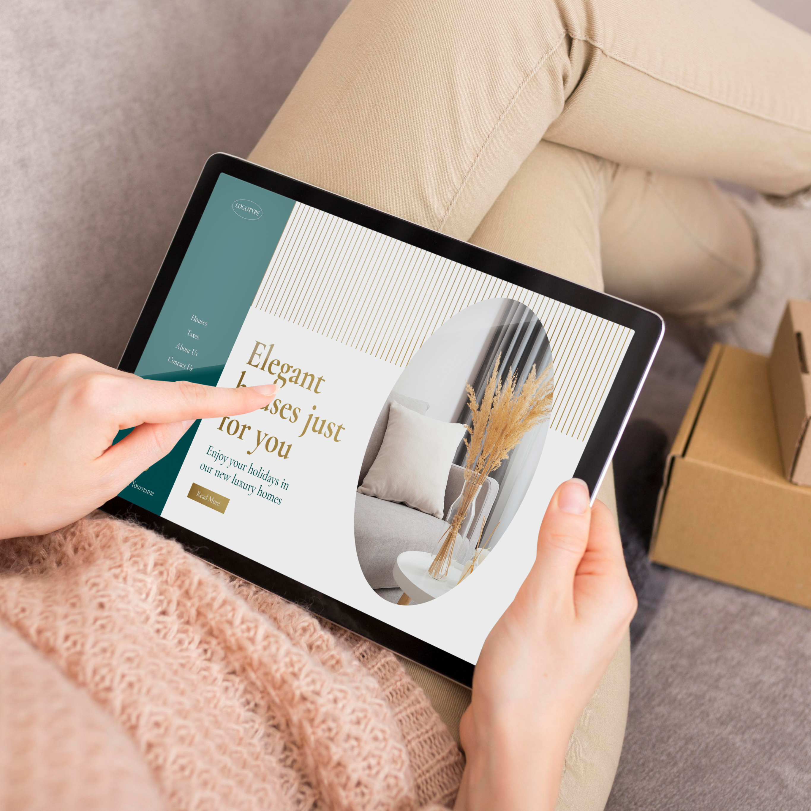
Wide
Products: 1080 x 1080 px.
Blog: Minimum of 1024px of width. Proportional height depending on how you want to display it.
Category: Minimum of 1024px of width. Proportional height depending on how you want to display it.
Store Logo: height: 100px to 200px and width: 100px to 500px.
Pop Up Image: width: 300px to 1140px. Proportional height depending on how you want to display it.
Recommended Sizes for Components:
Slider Component
Image Size (Desktop): 1440 x 780 px or proportional height depending on how you want to display it.
Image Size (Mobile): 575 x 450 px or proportional height depending on how you want to display it.
Banner Component
Image Size (Desktop and Mobile): 760 x 440 px or proportional height depending on how you want to display it.
Big Banner Component
Image Size: We recommend a minimum of 1440px of width. Proportional height depending on how you want to display it.
Image with Text Component
Image Size (Desktop and Mobile): We recommend a minimum of 750px of width. Proportional height depending on how you want to display it.
Logos slider Component
Image Size: We recommend a maximum of 150px of width. Proportional height depending on how you want to display it.
Testimonial Component
Image Size: 50 x 50 px.
Apparel
Product images: 1210 x 1210 px.
Store Logo: will be displayed in a maximum of 50px of height and a proportional width.
Cart Logo (shopping process): will be displayed in a minimum of 10px and a maximum of 120px in height.
Success Logo (shopping process): will be displayed in a minimum of 10px and a maximum of 120px in height.
Category image: We recommend a minimum of 1024 x 150 px
Header: there are different types of images in the header:
Header logo: We recommend a maximum of 150px of width and 10px to 120px of height.
Header logo mobile: We recommend a maximum of 120px of width and 10px to 120px of height.
Footer logo: We recommend a maximum of 250px of width and 10px to 120px of height.
Mobile Menu (logo): We recommend a maximum of 250px of width and 10px to 120px of height.
Store Message (logo): We recommend a maximum of 1300px of width. Proportional height depending on how you want to display it.
Customer Pages - Forms (logo): there are different types of images in the header:
Page logo: We recommend a maximum of 250px of width and 10px to 120px of height.
Left section (mobile): We recommend a maximum of 575px of width and minimum of 500px in height.
Left section (desktop): We recommend a minimum of 1400px of width and minimum of 768px in height
Recommended Sizes for Components:
Slider Component
Image Size (Desktop): 1600 x 600 px or proportional height depending on how you want to display it.
Image Size (Mobile): 575 x 400 px or proportional height depending on how you want to display it.
Banner Component
Image Size (Desktop): We recommend a minimum of 640px of width. Proportional height depending on how you want to display it.
Image Size (Mobile): We recommend a maximum of 575px of width. Proportional height depending on how you want to display it.
Accordion Component
Image Size: We recommend a minimum of 520px of width. Proportional height depending on how you want to display it.
Collage Component
Image Size (Desktop): 1000 x 900 px or proportional height depending on how you want to display it.
Image Size (Mobile): 575 x 500 px or proportional height depending on how you want to display it.
Collection Component
Image Size (Desktop): 800 x 1200 px or proportional height depending on how you want to display it.
Image Size (Mobile): 767 x 180 px or proportional height depending on how you want to display it.
Flexible Content Component
Image Size (Desktop): We recommend a minimum of 750px of width and 430px of height or proportional height depending on how you want to display it.
Image Size (Mobile): We recommend a minimum of 552px of width and 340px of height or proportional height depending on how you want to display it.
Gallery Component
Slider Image Size: We recommend a maximum of 700px of width. The height of the slider will adapt to the height of the banners.
Banner Image Size (Desktop): 600 x 300 px or proportional height depending on how you want to display it.
Banner Image Size (Mobile): 750 x 460 px or proportional height depending on how you want to display it.
Lookbook Component
Image Size (Desktop): We recommend a minimum of 700px. Proportional height depending on how you want to display it.
Image Size (Mobile): We recommend a maximum of 575px. Proportional height depending on how you want to display it.
Logo Carousel Component
Image Size: We recommend a maximum of 200px of width. Proportional height depending on how you want to display it.
Pop Up Component
Image Size: We recommend a maximum of 500px of width. Proportional height depending on how you want to display it.